Field notes from the workshop, posted when there is something worth saying

This is the running record: five posts currently in the queue, each one tied to a specific problem at the press, the bench or the desk. Nothing here is scheduled to a calendar. Entries go up once a run is finished and the notes are honest enough to publish.

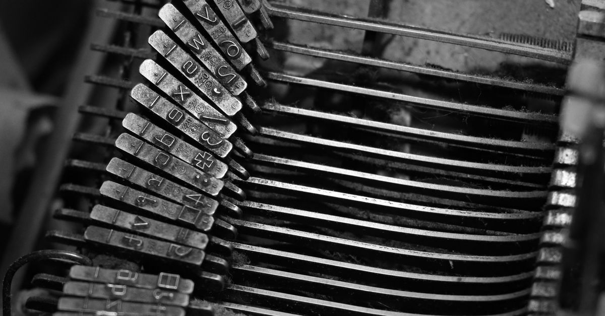
Close view of metal letterpress type arranged in a wooden composing stick

Setting Metal Type by Hand in a Woodstock Workshop

Hand-setting a paragraph of metal type is slower than most people expect, and the slowness is the point. You learn to read the stick as you build it, checking that each line sits tight without forcing the spaces, and you notice how a single thin space can throw the whole measure off. This piece walks through a typical afternoon in a Woodstock workshop: choosing a face, setting a few lines, locking the forme, and pulling the first proof. It also covers the mistakes that show up most often, from uneven word spacing to a loose quoin that shifts under pressure, and how to spot them before the ink goes down.
Stack of textured paper sheets and printed pages on a studio table

Choosing Paper Stock for Letterpress and Risograph

Paper is the variable that surprises people most when they move from digital proofs to a real press. A soft cotton sheet takes a deep impression and holds fine hairlines, while a hard-sized stock can crush the type and leave a halo of ink around every letter. This guide compares a handful of stocks commonly available in South Africa, looking at weight, surface and how each one responds to letterpress and risograph. It also covers grain direction, why it matters when you fold a cover, and how humidity in a Cape Town winter can change the way a sheet feeds through the press.

Risograph printer with printed sheets stacked beside it in a small studio

Risograph Quirks Worth Knowing Before You Print

A risograph is not a precise machine, and trying to force it into one usually ends in frustration. The drum leaves its own texture, registration drifts by a millimetre or two between passes, and the ink never quite dries the way you expect. This piece collects the quirks that come up most often in small studio runs and explains what causes them. It also suggests ways to design with the drift rather than against it, from choosing colours that overlap gracefully to leaving margins that forgive a slight shift. The aim is not to fix the machine but to understand what it is actually doing.

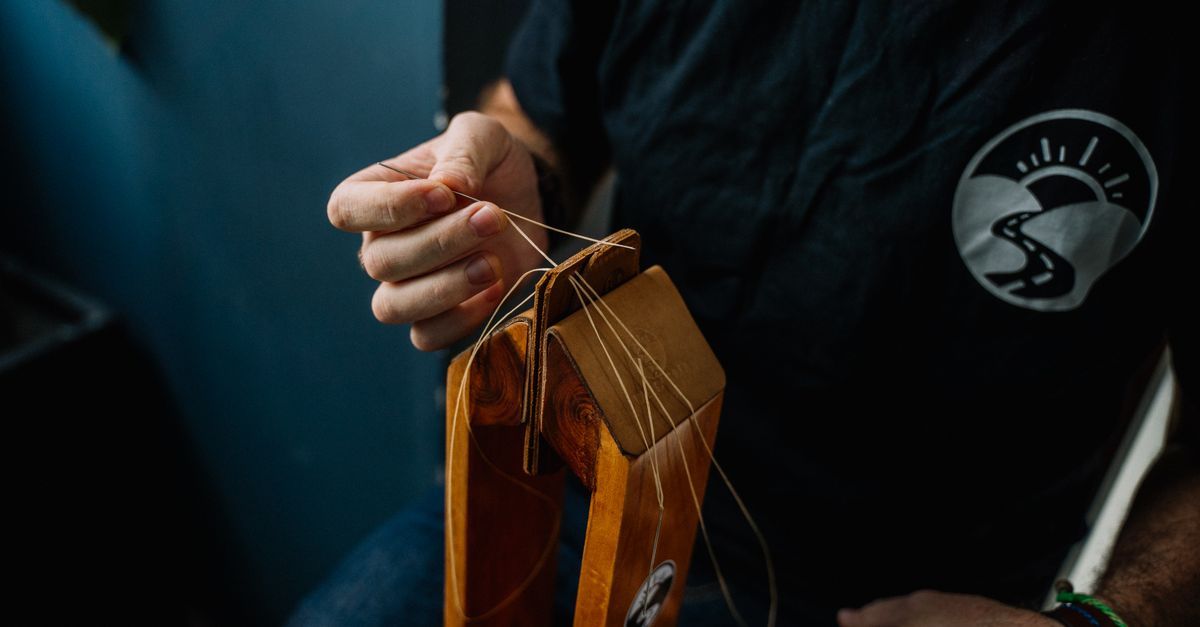
Hands stitching the spine of a small handmade booklet with thread

Zine Binding Methods for Short Runs

Binding decides how a zine feels in the hand long before anyone reads a word of it. A simple saddle stitch is fast and forgiving, a pamphlet stitch with a visible thread adds weight, and a coptic binding opens flat but asks for patience and a steady awl. This piece compares several methods that suit editions of twenty to two hundred copies, looking at the tools each one needs and the time it takes per book. It also covers the small decisions that matter more than they seem, such as thread weight, hole spacing and how much of the spine you leave exposed.

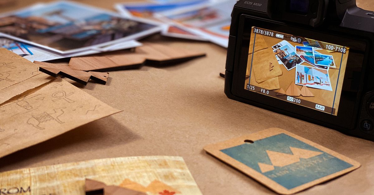
Camera on a desk pointed at a printed sheet lit by a window

Photographing Prints and Type Without a Studio

Photographing a print is mostly about controlling one light source and being honest about what a small setup can do. A single window with a diffuser will show paper grain and the relief of a deep impression far better than a flash, and a low angle across the sheet reveals texture that a flat overhead shot hides. This piece covers the practical side: where to place the camera, how to keep the sheet flat without crushing it, and why a grey card saves time later. It also notes the limits of working without a studio, so you know when a detail is simply beyond what the setup can capture.

Send a note about what you are working on

The blog runs slowly, and so does the inbox. If a post about hand-set type, a stubborn paper stock or a risograph that refused to register raised a question, you can write to the address below. Short questions about technique, tools or materials are the ones that get read first.

Useful things to include: the press or process you are working with, the paper or ink you are using, and what actually went wrong. A photo of the proof helps more than a long description. Notes about local suppliers and open studio days around Johannesburg and further afield are always welcome.

Where to reach the writer

Post
The Mills, 66 Carr Street, Newtown, Johannesburg, 2001, South Africa

For anything longer than a quick question, the contact page has the full form and the details on how submissions are handled.

Go to the contact page