
What these notes look like in a working studio

Four situations that come up again and again in small South African print rooms, with the tool, the material and the result left visible.

Hunter Ashworth: use cases

Laid or wove for a short poetry run

A letterpress operator sets a twelve-line poem and pulls proofs on two sheets. The laid stock holds the impression cleanly but the chain lines fight the fine serifs. The wove sheet takes the same pressure with less crush, so the run moves to wove and the forme stays locked.

Hunter Ashworth: use cases

A zine that has to lie flat

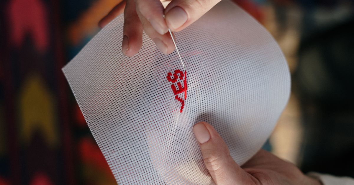
A binder tests a Coptic stitch on a forty-page zine meant to be read open on a table. The first attempt uses thread that is too thick and the signatures gap at the spine. Switching to a finer linen thread and widening the hole spacing closes the gaps without losing the flat opening.

Hunter Ashworth: use cases

Uneven ink density on recycled stock

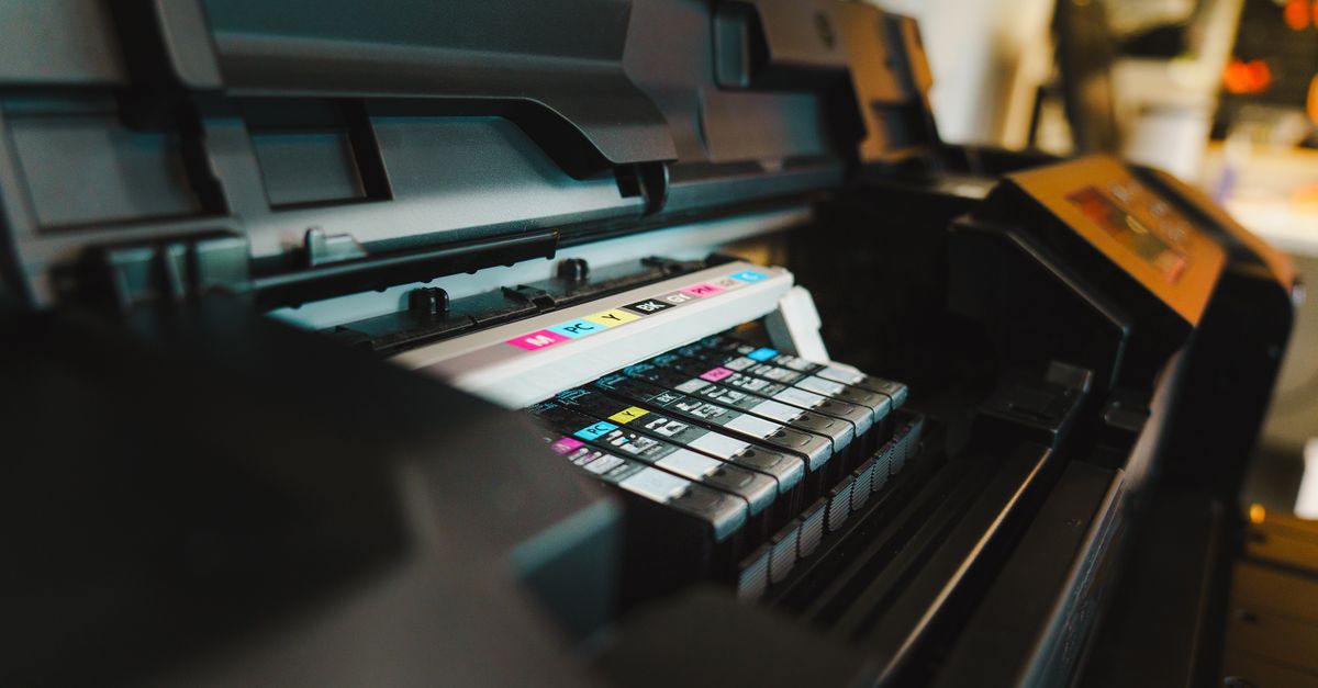
A student runs a two-colour cover on recycled paper and gets patchy coverage across the middle of the sheet. The drum is fine; the stock is thirsty and slightly cockled. Flattening the paper overnight and slowing the feed speed evens out the density, though the texture stays visible.

Hunter Ashworth: use cases

Metal type against polymer plates

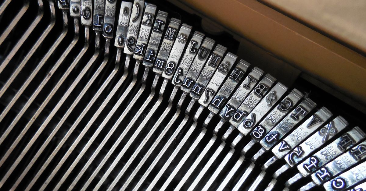
A publisher weighs a limited edition set in metal against polymer plates for a longer run. Metal gives the deeper bite and the irregular edges people come for, but the makeready takes an afternoon. Polymer is faster and more even; the trade is a flatter impression and less character in the hairlines.

Reading that follows the work

These pieces pick up where the scenarios leave off: the same tools, the same materials, the same small decisions that decide whether a run holds together. Start with whichever one matches what is on your bench right now.

Composing stick

Setting Metal Type by Hand in a Woodstock Workshop

An afternoon at the stick, told with the mistakes left in. Uneven word spacing, a loose quoin, the moment a line finally sits tight without forcing the spaces.

Read the workshop notes

Paper and ink

Choosing Paper Stock for Letterpress and Risograph

Why a soft cotton sheet takes a deep impression while a hard-sized stock crushes the type. Weight, surface, grain direction and what winter humidity does to a feed.

Compare the stocks

Studio floor

Risograph Quirks Worth Knowing Before You Print

Misregistration, roller marks and ink that never quite dries on schedule. Notes on designing with the drift instead of fighting a machine that will not sit still.

Browse all field notes

Why these notes hold up in a working studio

Most writing about print stays at the level of admiration. These field notes come from afternoons spent at the composing stick, at the riso drum, and at the bench with an awl in hand. The difference is simple: the material gets named, the failure gets recorded, and the adjustment gets written down.

Named materials, not vague advice

When a laid sheet crushes under a deep impression and a wove sheet takes it cleanly, that gets written down as it happened. Paper weight, grain direction, ink tack and roller pressure are treated as the variables they are, not as background detail.

The failures stay in the text

A loose quoin that shifts mid-pull, a Coptic stitch that will not lie flat, uneven riso density on recycled stock. Each of those is more useful than a clean success story, because it tells you what to check before the ink goes down.

Written from South African print rooms

Suppliers, open studio days and the stocks that are actually reachable here shape what gets covered. The notes assume you are working in a small space with limited equipment, not in a fully kitted commercial shop.

How this differs from a tutorial

A tutorial tells you the correct method. These notes tell you what happened when the method met a humid afternoon, a blunt blade or a drum that had its own opinion. Both are useful, but only one prepares you for the second attempt.

Where to go next

If you want the longer material comparisons and the workshop write-ups behind these scenarios, the resources page collects them in one place. For a broader look at what the blog covers across letterpress, riso and binding, see the plans overview.